Adventures by Disney Cruise Line Feature
Responsive Web • Interaction Design • Visual Design • User Testing • Strategy
For the Disney Cruise Line LOB I work on a project called ‘Small Enhancements’. It’s supposed to be minuscule modifications or additions to any part of the Disney Cruise Line website that any underlying line of business brings to our attention. One of the more notable projects included in the Small Enhancements was the addition of Adventures by Disney to the online Disney Cruise Line reservation portal. Our team was approached by the Adventures by Disney group. The ask was to surface information somewhere in our guest portal which would allow people with booked cruises to purchase Adventures by Disney add-on packages.
**Note: Yes, this project also has mobile screens. Because we had data suggesting that 90+% of our users only accessed this page on desktop browsers I’m going to spend this case study talking to the responsive desktop vs the mobile screens.
Opportunity and Goals
Adventures by Disney are exclusive excursions packages marketed towards high end guests. They are costly, sometimes even exceeding the original price of the cruise. Because of this, we were to ensure that Adventures by Disney continued to present itself as an exclusive brand and not as a run of the mill experience.
Adventures by Disney wanted to attract Cruise clientele to its own website where all bookings would take place: this project did not include designing that booking flow.
The option to view Adventures by Disney packages would only present themselves after a guest had a cruise booking. Only the package associated with the booked cruise would show up. The ask was to take guests to this specific curated package page, not to give basic information about Adventures by Disney as a tour group.
Below are the two pages that make up our Guest Portal that I would look at for placement of Adventures by Disney:

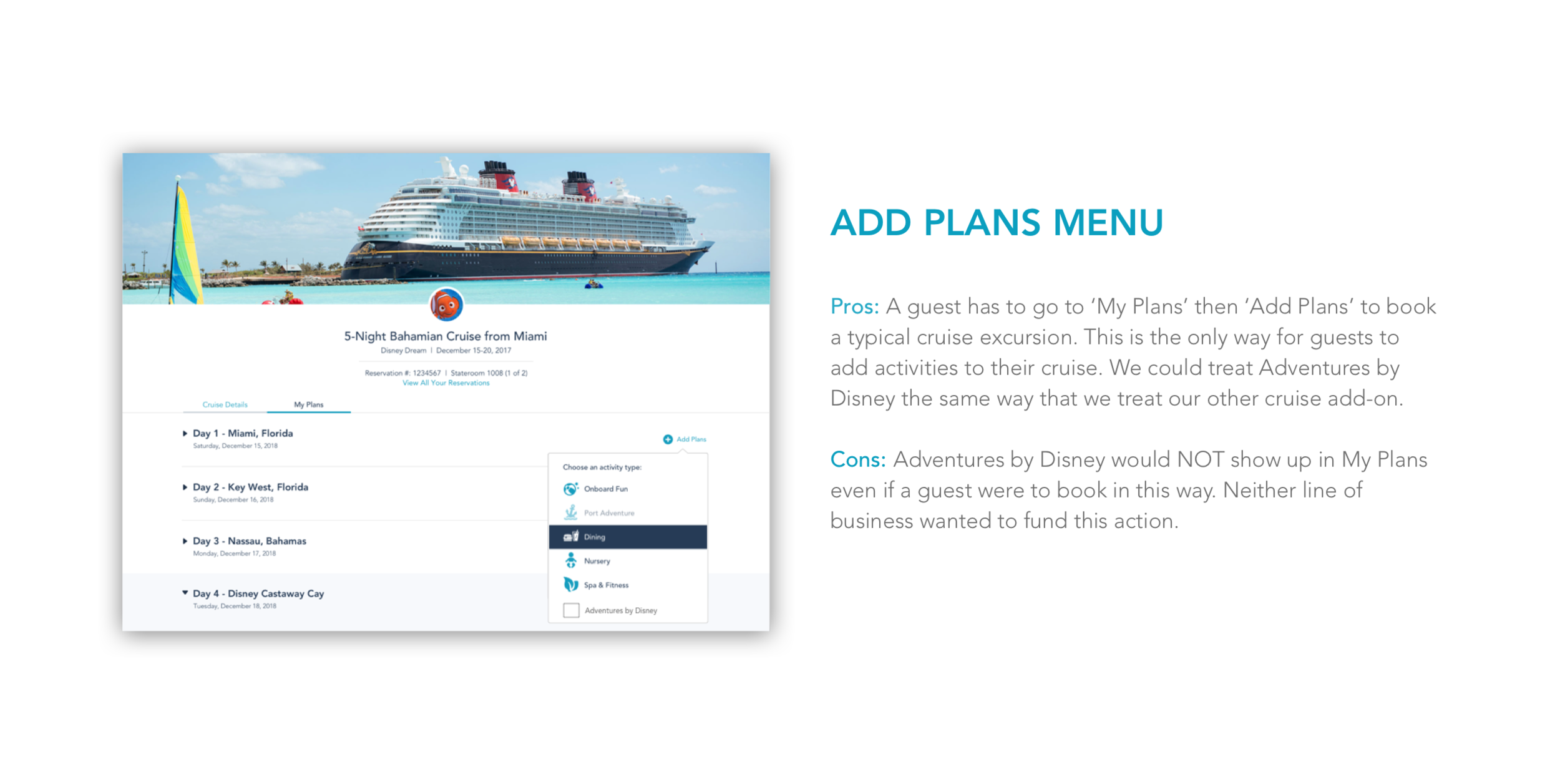
Brainstorming Entry Points
My first step was to think about possible entry points for Adventures by Disney in our Guest Experience. I came up with three possible options and weighed the pros and cons. I then presented these options to the design team as well as key stakeholders.


Takeaways
After talking with the design team and our stakeholder partners I decided that the right way to move forward would be to place Adventures by Disney on the Cruise Details page. The risk of guests becoming confused when Adventures by Disney bookings did not show up on the My Plans page was too high and we did not want to overwhelm our call lines. At this point I knew which page it would live on, but was still unsure of its hierarchy on that page.
Page Hierarchy
Placing Adventures by Disney high on the page concerned me because the price could possibly scare guests away from other more affordable add-on cruise experiences. When considering placing the tile lower on the page I began accessing our heat mapping software and found that guests were skipping the section of the page that I felt this best fit into. This section was called ‘Add More Magic’ and it was where we hosted offers for add-ons to the Cruise such as our Photography packages. To me this section made sense to place Adventures by Disney into because it was a like product akin to Photography. The strangest thing I learned from our heat mapping software was that our footer content and links directly below this Add More Magic section had very high engagement. It was as if guests were missing the section completely, on average spending less than a second viewing these offers.
I broke down the Cruise Details screen engagement findings to help aid my case for a user test that I wanted to run. I wanted this test not only to cover placement of the Adventures by Disney tile, but also to touch on why we saw such little guest engagement in our Add More Magic section of the page.
I asked myself the following questions: Were the offers in the Add More Magic section not resonating with our guests? Or, are guests overlooking this section because of some other reason?

User Testing
I was able to convince Product partners that a quick User test where we brought in two different entry points for Adventures by Disney, one high on the page, and one low, could help us to determine the cause of guests skipping over information lower on the page.

Testing Results
We learned that placing Adventures by Disney higher up on the page caused for much confusion between the new tile and the existing Cruise Activities tile. Additionally, we discovered that our ‘Add More Magic’ section was not enticing to guests because of the way it was displayed not because of the content inside of it. We now knew that Adventures by Disney needed to be lower on the page, but we had some additional work to fix the underlying issues with the page so that it would not get lost.
Major Takeaways Higher Placement
Guests became confused between the Adventures tile and our Cruise Activities tile. Many guests couldn’t distinguish the difference between the tiles on first view.
Some people mentioned that Adventures by Disney must be an onshore activity while Cruise Activities were onboard.
When asked about price comparisons between these two experiences users often could not tell which one would be priced higher.
Major Takeaways Lower Placement
Guests had to really dig around when asked about the Adventures by Disney offering on this page. They had a hard time finding it in the Add More Magic section.
However, after guests eventually located the tile they were able to more easily (and correctly) explain the differences between Adventures by Disney and Cruise Activities.
Takeaways from Add More Magic
Guests viewed Add More Magic as an ad. They often wouldn’t read the offers and would skip right over the section.
When asked about specific offerings like the Photography packages housed under Add More Magic guests expressed interest in them but said that they did not see them on this page.
Scope Change
I realized that this project was becoming less about just finding a place to add Adventures by Disney to our Guest Portal and more about fixing the way that we presented guests with offers in that portal. I got approval from my Small Enhancements team to take my user testing learns and make them actionable by reworking this section of the page.
Add More Magic Rework
I expanded the Add More Magic section to include larger eye catching Photography. I thought that if the images were larger than the text space they might catch the eye of our guests and drive more engagement. I tested this theory in a quick 5 minute usertesting.com test where I asked guests about the Adventures by Disney and Photography packages on the page. Guests were able to more easily find and interact with our tiles in the new format.

Reworking the Get Ready to Cruise Section
Because of the initial heat map which showed the first line of tiles in Get Ready to Cruise as having strong engagement and the second line as having medium engagement I decided to rework the section. The first tile in the get ready to cruise section was ‘Before you Can Board’. It housed important boarding documents and had relatively high engagement from guests. The following two offers in this section Special Requests (Dietary ) and Download the App, were not applicable to the majority of our users. I worried that this disengagement may be causing some level of information blindness to what came next in the Add More Magic section of the page. I proposed reducing the three tiles to from two lines to one line in hopes that condensing them into one line would allow users to more easily see the Add More Magic section underneath and boost interaction.

The design team liked the borderless option feeling like it visually separated the important high level top of page information from the less important lower page information. I tested this design to make sure that guests wouldn’t stop scrolling after reaching it thinking that it was the bottom of the page.
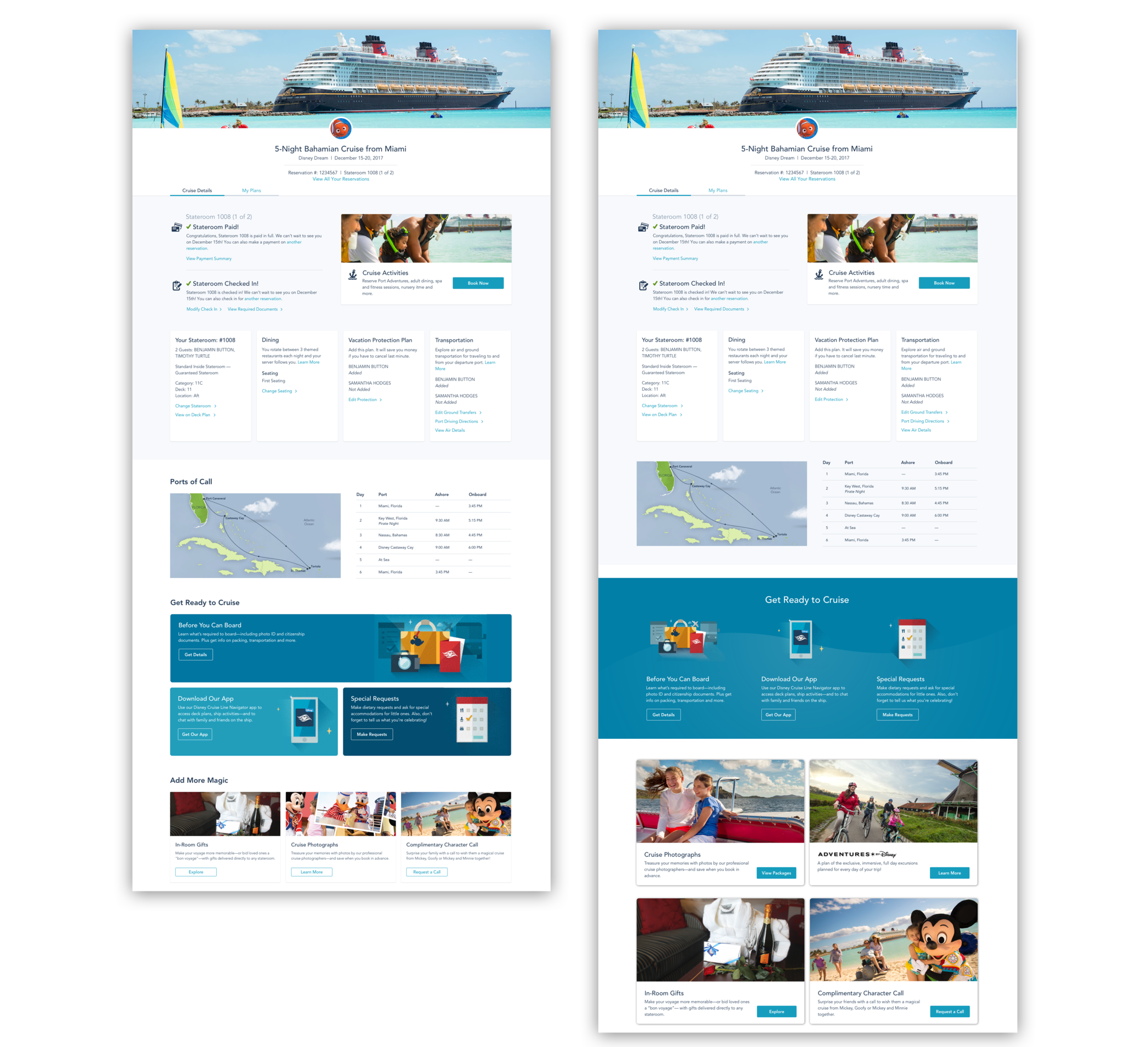
Finalized Before and After
oThe redesigned ‘Get Ready to Cruise’ section created a visual separator between the top need to know booking information and the bottom offers section. The offers themselves are larger and presented in a way that feel less ad-like. The photo selection and Adventures by Disney branding differentiates the tile from Cruise Activities. In heat mapping software guests spent significantly more time looking at the offers section of the page after the updates were made.
Results & Learnings
The initial project ask and the scope of this project grew significantly as I moved through my design process. I was able to proud to be able to convince our stakeholders to add in necessary changes that not satisfied the original ask from Adventures by Disney but also improved upon the overall experience of the Cruise Details page. After the updates were made guests engaged more on average with Cruise Photographs and In-Room Gifts than before the update. The Get Ready to Cruise section traffic had no noticeable change proving that we changing the layout of that section would not negatively impact any content housed in that section.
Being able to pull user engagement from heat-mapping software was a recent addition to the tools available to me as a Product Designer at Disney. This project allowed me to test out that software and learn how powerful it could be as a tool to aid my future designs.