
Read Anywhere App
iOS • Android • Interaction Design • Motion Design • Accessibility • Microcopy
Read Anywhere is a McGraw-Hill Education eReader that allows students to connect to their textbook on the go. Students can take inline notes, make highlights and bookmark passages. All annotations sync across devices. Read Anywhere is offered on both iOS and Android platforms as well as responsive web. As the lead UX Designer on this project I worked on an agile scrum team to design and build the iOS and Android applications. I worked closely with business stakeholders and developers during this process.
iOS App on iTunes • Android App on Google Play
iOS has 4.6 Stars and over 4K Reviews, Android has 3.6 Stars with 500+ reviews
The Opportunity
When I joined this scrum team their designer had quit and the UX work was behind schedule. The main framework for the responsive web was in place but both iOS and Android were far from finished. The development team had continued to build with an absent UX Designer for several months before I arrived. The team was in a bind because marketing had already sold the non-existent applications to a company who wanted to use it for an HR course textbook. Because of this sale the buyer had some input into the direction of the product.
Rough Flow
I started with a rough flow of how Read Anywhere would function as an application. This was based off of work that had previously been done for responsive web and the differences that I suspected mobile would require.
The main inclusions that I found the app to need were:
Mobile needed a way to download chapters individually and in full depending on capacity of students available phone space
Students needed to be able to export and share their notes in a way that would make sense for their device type
Mobile had more legal requirements than web and needed an opt in or privacy policy information section

Wireframing & Visual Design Decisions
Being that this was an eReader application there was little visual design involved in it. Since we had a tight timeline with the sale of the app I moved very quickly from wireframes into visual design early on in my process.
Table of Contents
While in the wire framing stage I worked closely with the development team to include them in the process. From this process it was determined that iOS would feature an initial full screen menu whereas had to be a drawer to achieve the chapter by chapter download pattern we desired.

Annotation Menu
For the Annotation menu which would allow students to highlight, take notes and put placemarks in text I presented a variety of options of where I thought it should live on the page. The team and I decided to test placing it at the top of the page and the bottom of the page in a quick dev build. Due to lack of resources we used internal non designers on different scrum teams to decide on final placement. We found that placing the annotation menu at the bottom of the page interfered with a users ability to scroll through notes. The final design of the annotations can be seen below.
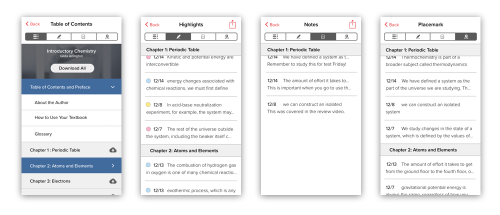
This is the iOS version of annotations. Students have the ability to highlight text, add notes and placemark (bookmark) passages that they find important.
Scope Creep
As the application design process progressed and our team went through quite a shakeup. We lost a lot of people and replaced them with new people. This caused an influx of new ideas entering the app and a lot of requests for new features.
New features included:
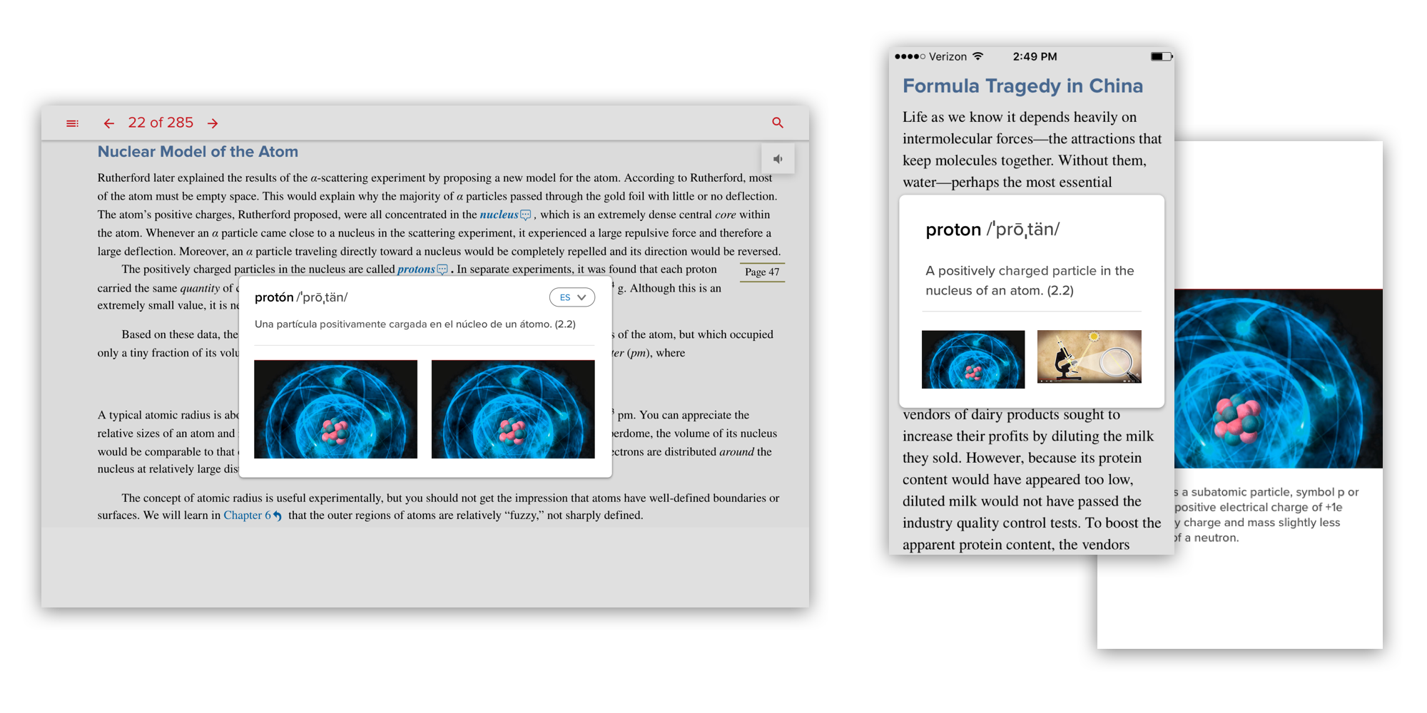
A glossary feature that would allow up to three media items to be attached to words (graphs, videos and images).
A language switcher for ESL students
An error screens for when a title expired explaining to students the multiple reasons why they could no longer access their textbook and steps they could take to resolve the issue.
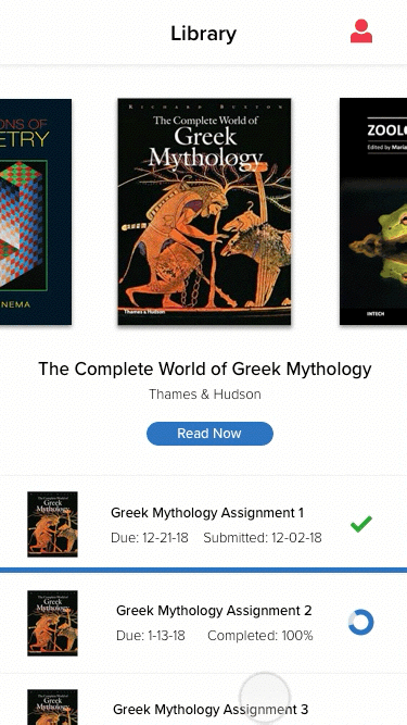
The ability to add assignments tied directly to a title. This would be housed in a library of books (future request) .
Option 1
Option 2
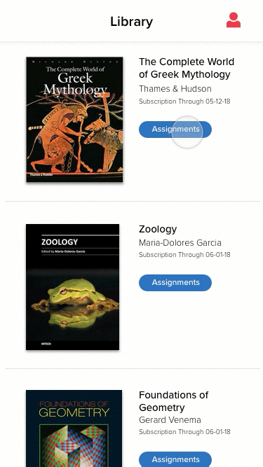
Library & Adding Assignments to a Title
A future request was added to create the ability to add assignments. In ReadAnywhere assignments would just be assigned readings but the combined library/assignments feature would set the groundwork for another application the company was working on called Smartbook.
I mocked up two different ways to display the library and assignments pages using Principle. The mobile team had some extra time left in one of our sprints and wanted to explore the interactions of this page.
We decided to go with Option 1 in the end. This decision was made because it was likely that most of our users only had two or three books in their library at one time. Option 1 would allow users to fully see all of the textbooks in their library without having to scroll. It was also the easier to make this option accessible.
Glossary
We were asked to create a customized glossary element that would allow course creators to tie up to three content items to words. These items could come in the form of videos, images and graphs. This component was something that the ReadAnywhere team built keeping in mind it would ultimately be used by other teams in the office. I worked with several Product Managers spread across teams at McGraw-Hill to design this feature so that it could be reusable for everyone. I did several different mockups of how the modal would popup in Origami Studio and worked closely with development to make the interactions feel smooth.
Accessibility Guidelines & User Testing
The Read Anywhere team pioneered accessibility at MHE. We were the first of the Seattle teams to be held to AA Accessibility standards. There was no defined process as to how to address this yet from a design perspective. I worked closely with QA to figure out how to use screen readers, check for color contrast and design focus states.
User Testing
While I ran all of our usual user testing, the far more interesting testing that I got to be a part of on this project was testing on blind and partially sighted users. This testing was included as part of our accessibility stage in the project.
Testing Takeaways
I found a big lapse in labeling that had a significant impact on fully blind users. This issue was resolved with a copy deck I created and more time spent listening to screen readers.
Testing partially sighted users revealed that our focus states weren’t always as eye catching as they needed to be. I upped the contrast on these states and changed them to a dotted line instead of a solid thinner line.
People with partial sight had a hard time navigating our gray search results page. I swapped the gray for a higher contrast blue and white combination that can be seen below.

Accessibility Audit Results
We achieved a 98% AA rating for iOS, 96% for Android and 89% for web. This was a good first shot at accessibility and helped to pioneer the way that we went about documenting accessibility at MHE.
Updates After Release
After the initial release of the app our team continued to make improvements based on user feedback. We had dedicated people going through the user reviews on the iOS and Android stores and recording user issues. We prioritized this feedback from most to least requested.
One of the most requested features by students was a way to sort through annotations with filters. I worked off of the feedback and created a way for students to filter by color of annotation, chapter range and date the annotation was created. We were able to push this update quickly after launch. It can be seen below.

Results & Learnings
We were able to satisfy the client with the first release of the app. A bonus to this client was that they allowed us to track data on the product and make improvements as we saw fit. The product team has continued to make updates and add features in the past couple of years.
Before this project I hadn’t had much experience with accessibility. This was an incredible learning opportunity for me. Working on accessibility the way that I did with this team gave me a new understanding of how difficult and frustrating technology can be for some people. Since this experience I've taken a special interest in accessibility on all of my digital projects.
This project allowed me to build a new skillset in motion prototyping. I used Principle to communicate design interactions to development. Previously I had been using either Axure or Adobe After Effects, both of which took a lot of time. I love that I found a program that allowed me to produce an interactive prototype in just a couple of hours.