
Smartbook 2.0 App
Screenflows • Wireframing • Prototyping • Accessibility • Motion Design • User Acceptance Testing
Smartbook is a combination of two existing McGraw-Hill learning applications. Read Anywhere was built as a McGraw-Hill eReader and Studywise was built as a McGraw-Hill quizzing and review app. Smartbook was designed to be the best of both worlds, an application that students could read their assigned textbook material, and quiz themselves to check understanding on the content. As the lead UX Designer and UX Researcher on the project I was in charge of the project from start to finish. I worked on the initial user flows, interaction design, user acceptance testing, accessibility and worked alongside development team on the final build.
Process
Combining two existing application's workflow's was not an easy feat. I was the designer for Read Anywhere but I knew almost nothing about how Studywise worked. My first step was to sit down with the Studywise designer and learn the ins and outs of the application. My two main takeaways from this conversation were:
The Studywise application employed ‘metacognitive levels’ and had three levels of how confident a user was in their answer
Studywise taught students materials without having them read material, it was a learn by doing approach. This contrasted greatly from ReadAnywhere which was a content first approach.
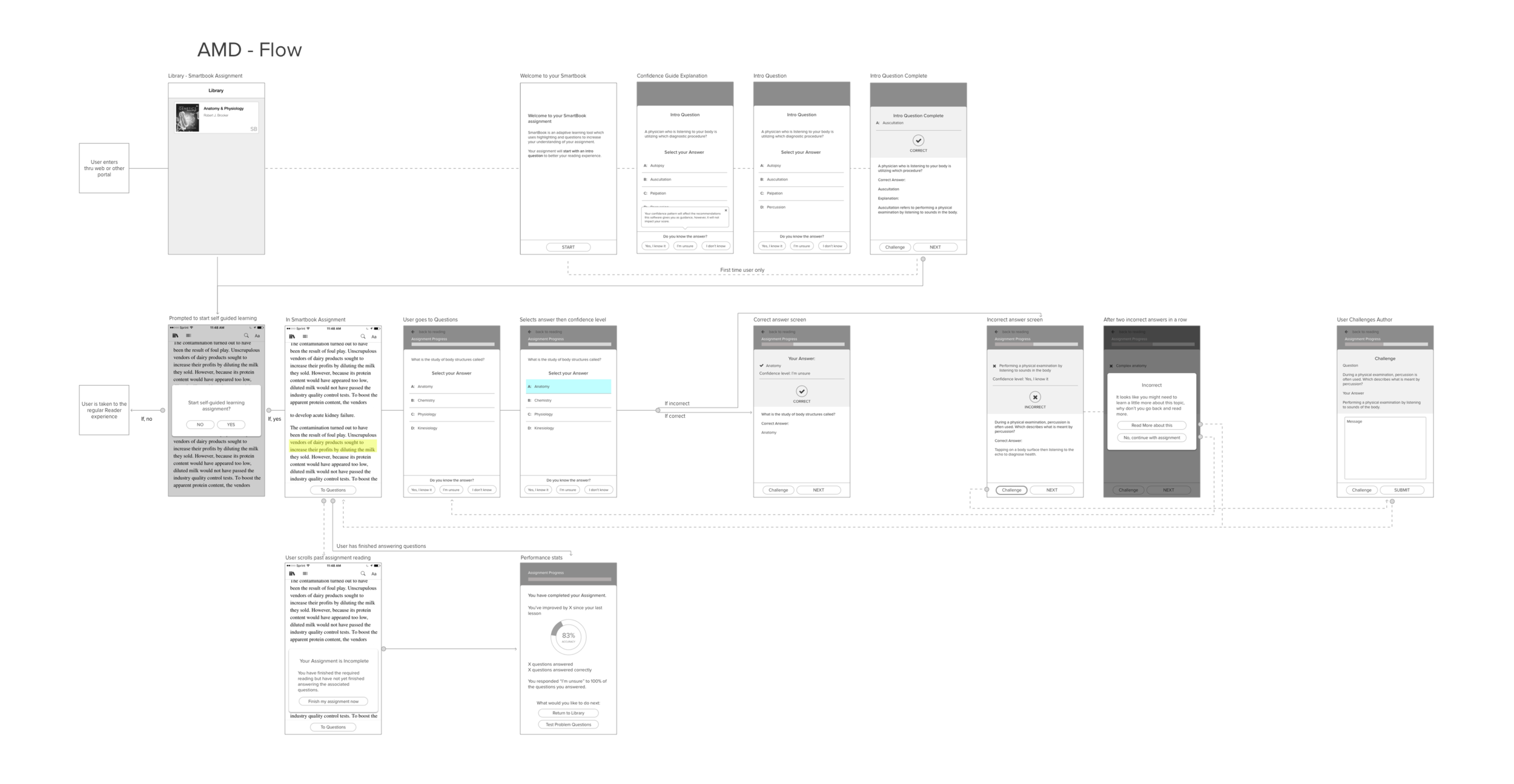
I created a basic screen flow of how to combine the two applications. Since there was little time and so much happening I first mocked this up using sticky notes that I could move around. I used green for existing Reader screens, pink for existing Studwise screens and purple for screens I would need to stitch the experiences together. I then moved into a basic wireframe and flow exercise as seen below.

Testing
To test my flow, I used Invision to create a click through prototype of the wireframes. I planned a Qualitative User Study. I structured the testing tasks and contributed towards the testing script. Six students taking college level classes were recruited for this initial moderated study.
Results & Discoveries
The main pain points found included:
Students didn't understand how choosing a confidence level would impact their learning.
Some students weren't sure about the meaning of the term "adaptive learning tool" that they encountered during onboarding.
Many students were confused by the 'Challenge' feature. Even after the moderator explained the feature most students they saw little to no value it using it.
The wrap up screen didn’t do a good job at showing users how they performed overall.
I revised the wireframes based on user testing discoveries. This included updates to the verbiage, a more in depth wrap up screen that showed students specific areas to focus on, and a better explanation of confidence levels. At this time I was also able to convince the team that the challenge feature should be removed as students were unlikely to utilize it.
Accessibility
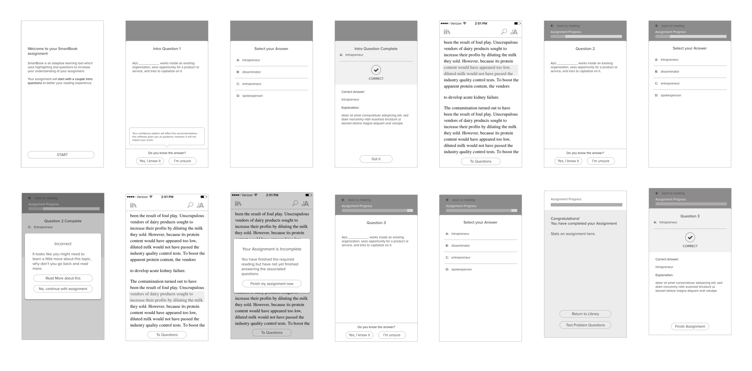
I worked to unify the two pre-existing UI's from both applications. This effort had a strong focus on AA Accessibility standards. The ReadAnywhere application had already undergone extensive AA testing and had gotten fairly good scores, but the Studywise application was old enough that accessibility had not originally been considered when it was built. I worked with my team’s Lead QA person to make sure that the interface for Smartbook would meet AA guidelines. This included two rounds of stringent accessibility audits conducted by an outside firm. Below are examples of the new accessible UI that was produced:

These screens show how a user would progress through an assignment. Here a user is starting with reading, moving onto answering questions and answering the question correctly.
User Acceptance Testing
After the stitched together UI was in built it was time to see our finalized application performed before we released it to markets. We had recently lost our User Researcher for the Seattle office. Since I had previous testing experience it was decided that I would be in full control of a moderated user study. I was given budget to test 16-18 students and caught a flight down to California where our partnering University students lived.
Working with real live question types vs. the initial Invision prototype that we had previously tested provided more in depth feedback. There were three show stoppers that were uncovered and addressed before release. These were:
When a question featured answers longer than two lines users would oftentimes answer incorrectly because they did not see answers that were only accessible via the scrollbar. To fix this I added in a small arrow to indicate that more answers existed than may currently be on the screen.
A question type that required dragging and matching answers was a major source of confusion for all of our test users. Users could not figure out the long press interaction required to match a question and answer. This fix required developers to rework the interaction into a instant drag instead of a long press.
Our new results screen (based on feedback from the first user test) now had too much text and users simply didn't want to read it all. I was able to further simplify this screen and to provide students with just the information they actually needed.
Final Prototype & Development
I updated the screens and built a prototype in Principle. This was used to help developers clean up the interactions built for the quick and dirty dev style prototype we had used in our testing.
Results & Learning
Smartbook was released in September 2018. It was marketed as a tool for the McGraw-Hill ConnectED Higher Education Platform suite.
Losing our User Researcher halfway through this project was hard as I had to step up and take over that responsibility not only just for this project, but for the entire office. This effectively doubled my workload. Previous to this experience I had never had to recruit students before. When our main researcher left she left no documentation on any of her contacts. I had to start from scratch using the limited teaching network of connections provided by the business. It was an eye opening experience for me. It solidified my continued interest in user research, which I was able to spend more time focusing on in graduate school.
If I was given more time I would have liked to spend it on the visual design. It was not a priority to the team or business and it showed. While the UI received excellent marks for accessibility testing, I believe it could have done that while also being visually pleasing to our users.