
The Enchanting Extras Collection
Research • Wireframes • A/B Testing • Interaction and Motion Design • Hybrid Product • Documentation
Enchanting Extras are exclusive bookable experiences (such as backstage tours and reserved fireworks seating) available at Walt Disney World and Disneyland Resorts. The goals of this project included creating a hub to list and sort experiences, and a way for guests to book and pay for experiences online. My main contributions were interaction design, research, and motion design.
Research
I kicked off research on this project by looking at how other websites listed and categorized events. I made a feature comparison chart to illustrate to the Product Team top highlights from competitor’s sites.

For the next part of my research phase I focused on learning as much as I could about the types of experiences that encompassed Disney’s bookable collection. I looked at Disney guests blogs and Youtube channels that mentioned the experiences as they were today.
I learned:
People who booked these experiences were most often repeat visitors such as Annual Passholders who came to Disney on a regular basis.
Reviewers pointed out that it was hard to book and find accurate information on the experiences online
After booking an experience experience guests often had questions about logistics and had to do their own detective work prior to the experience.
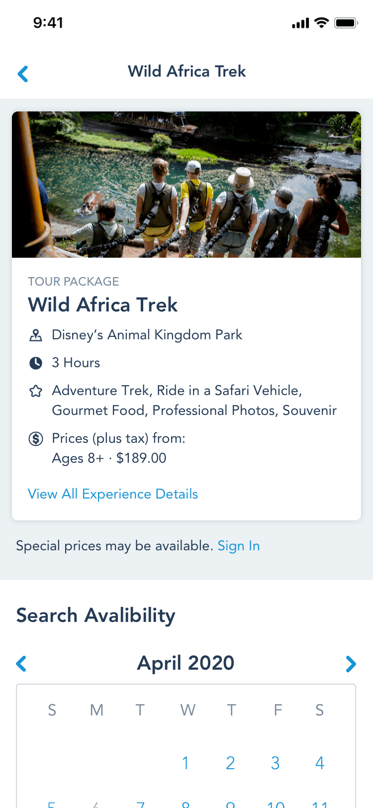
Configuration Page
The Product Team was on a tight timeline to get the product built and shipped. As such it was decided that the design phase could be split into two parts where each section was fully handed off to development teams separately.
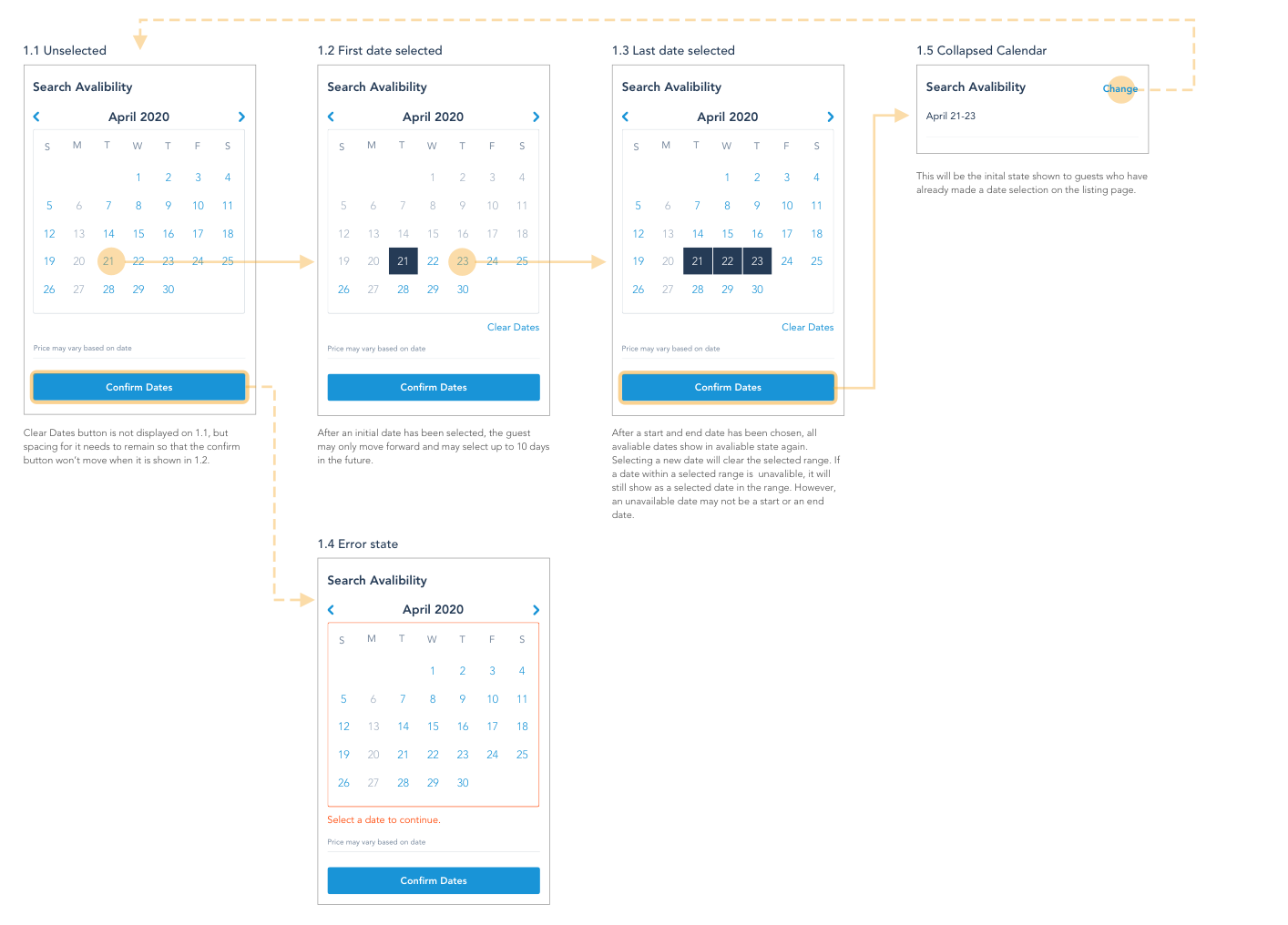
The Configuration flow became the first Design phase. This is where a guest would create the booking for their chosen experience. It featured configurable modules that could be swapped in an out depending on the needs of the experience. All experiences included dates and participant numbers, but the diverseness of experiences offered meant that some also included preferred time range, meal options, and other additional information. We worked mobile first and then expanded to desktop.
Below is the wired out flow that we presented to our stakeholders. Once we got approval we quickly moved into visual design and user testing. We hoped to be able to deliver this experience fully to our development team before moving to the list search experience.

Configuration Hi-Fi Screens
This is the simple version of the flow we decided on for the Configuration page. I chose to have each step appear after a user has made previous selections. This was done so that we weren’t overwhelming users with too many fields at once, and also because we needed a step by step process in order to run availability calls to our server. Originally I had put participants before the calendar but then I found that it would take too long for an avail call to be run for every single date and time. It was decided that open dates that had at least two spots would show up on the calendar and then after a time had been selected another avail call would be run to check the participants against that time and date. If the spot was sold out an error message would display in the form of a Mickey Mouse gif telling users to select another time.

List Page
The list page was created as a way for guests to see all available experiences and filter down options based on search criteria. We wanted our list page to:
Be easily scannable by guests.
Provide enough context to that help guests move forward with the booking process.
Guests who’ve inputted applicable booking information into the list page filters (date and number of people) will have that information transfer over to the config page. This means that list page will have two states: Pre Available - Before a guest has inputted date and people, and Post Available- after a guest has inputted this information.
The flow for the list page would look like:

Since the Disneyland app already had a list page, we were asked by our product partners if it would be possible to repurpose it for our list page. After taking a look at it I decided that it wouldn’t meet our list page goals for the following reasons:
There were multiple levels of information being presented on the same line (no clear visual hierarchy).
The small circular images would not help sell our experiences. It was hard to see any important visual context because of the image size and shape.

Using the information that we knew we could filter experiences by and taking into account how our current Disneyland App’s list page downfalls, I designed the following list tiles. I moved the image to the right hand side of the page so that I could keep a clean line of text that would be easily scannable to guests.

Displayed below is the fully completed Enchanting Extras List flow with filters (includes both the Pre and Post Available states).

UserTesting.com usability test
When wireframes and flows were close to being finalized we ran a quick test on UserTesting.com to determine if our flows fit within the way that we hypothesized users would go about the booking process. This resulted in microcopy changes, imagery and icon swaps and a change to the way that we had been displaying mealtimes to users.
Prototyping in Principle
I built all of the interactions for our prototype using Principle. I hoped to add just enough interaction to compliment the experience, but not enough to feel overwhelming or distracting. I worked closely with the development lead to ensure that the interactions I used were all possible to build in code.
Information Handoff & Working with Development
As the design work for the project started to slow down, the two other designers on the project transitioned to another team. It was decided that I would devote a few hours each week towards working with the scrum team through the finalized build. I served as point of contact for the next few months and attended weekly scrum sessions with the product and development team while our product was built.. I worked alongside them to see the design through, address product scope changes, and make changes when needed and update documentation as necessary. Below are some examples of the types of documentation that was provided to the development team.

This is the final product:

Final list pages and filters shown at Desktop and mobile sizes.

The final Config pages at tablet and mobile sizes.
Results & Lessons
This project pushed me to perfect my project documentation. In previous companies I had always been part of agile development teams which due to time constraints of sprints were sometimes a bit more lax on documentation. I was always around to explain things that my team had questions on in person. Disney’s assumes that any designer or developer could be moved to another project at a moments notice so documentation needs to be good enough that development could build from it even if they had never heard of the project before.
The most challenging aspect of this project was that it a hybrid product that jumps from app to web and back to app. It was tricky to combine the structure of these pages into a seamless experience. Although we tried to convince the business ahead of time that hybrid would not provide the most ideal guest experience that’s unfortunately a battle that design lost. If I could change one thing it would have been to build a fully integrated app experience. I’m hopeful that this will come into play further down the pipeline.
Enchanting Extras was released February 2020 after some unforeseen budget delays.